Table of Contents
Introduction
Choosing a finish for any metal product seems straightforward until you find yourself staring at a swatch book with hundreds of shades. Whether you’re refurbishing a garden gate, finishing automotive parts, or designing a commercial façade, the hue you settle on will define how the finished surface looks, performs, and ages over time. This guide unpacks everything beginners need to know about selecting powder coating colors, practical, jargon-free, and grounded in real industry experience so you can make a confident decision without second-guessing yourself later.
Why Color Selection Matters More Than You Think
A common assumption is that color is purely a matter of personal taste. In reality, your choice directly affects heat absorption, UV degradation, visibility of scratches, and long-term maintenance. Darker tones absorb more heat, which can be a real concern for outdoor metal furniture in regions with intense sunlight. Lighter shades reflect heat better but tend to show dust and contamination more easily.
Beyond aesthetics, the right hue influences resale value, brand identity for commercial projects, and even workplace safety. Industrial environments often rely on specific powder coating colors like safety yellow or warning red to comply with visibility regulations. So before you start browsing a swatch chart, take a moment to understand how much your selection contributes to the project’s long-term success.
Key Factors to Consider Before Selecting Your Shade
Picking the right finish isn’t just about flipping through a catalog. Several practical factors should guide your decision, and overlooking any of them can lead to disappointing results within just a year or two.
Application Environment Indoor vs Outdoor
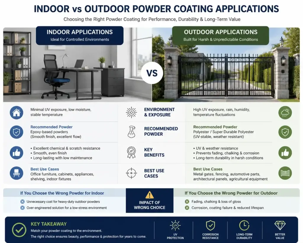
Indoor Use Cases
Indoor items like office furniture, light fixtures, appliances, and shelving face minimal exposure to UV rays, moisture, and temperature swings. For these, epoxy-based powders work beautifully and offer excellent chemical resistance, scratch resistance, and a smooth, even finish that lasts for years with very little maintenance.
Outdoor Use Cases
Substrate Material and Surface Preparation
Functional vs Aesthetic Priorities
Understanding Industry Color Standards
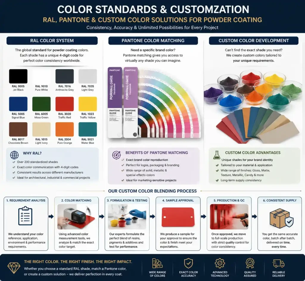
The RAL Color System
The RAL system is the global benchmark for powder coat finishes. Originating in Germany, it offers over 200 standardized shades, each with a unique four-digit code. RAL 9005 (Jet Black) and RAL 9010 (Pure White) are among the most requested powder coating colors worldwide. When you specify an RAL number, you eliminate ambiguity: every certified coater can match it precisely, regardless of location or batch.
Pantone Matching and Custom Shades
For brand-sensitive projects, Pantone matching is often required. While RAL covers most general needs, Pantone provides you with access to virtually any shade imaginable, including brand-specific tones used in logos and packaging. Custom color development is also possible, reputable manufacturers can formulate a unique pigment blend for your project, though minimum order quantities and lead times will apply.
Exploring Different Finish Options
Glossy, matte, and satin
A high-gloss finish reflects light beautifully and is easier to clean, making it popular for automotive components and consumer goods. Matte surfaces hide minor imperfections and offer a sophisticated, modern look ideal for architectural and furniture applications. Satin sits between the two, balancing subtle shine with everyday practicality and a slightly forgiving surface.
Textured and Specialty Finishes
Hammered, wrinkled, and sand textures add visual depth and disguise small surface flaws on uneven substrates. Specialty powder coating colors, metallic, pearlescent, candy, and fluorescent shades create stunning visual effects but typically cost more and require specialized application expertise. These are commonly used in automotive customization, designer furniture, and premium consumer product lines.
Common Choices Across Different Industries
Different sectors gravitate toward specific palettes based on tradition, regulation, and consumer expectation. Knowing the typical powder coating colors used in your industry helps with resale, replacement parts, and visual consistency across batches:
- Automotive: Black, silver, white, and bold metallics dominate
- Architectural: Anodized-look bronzes, grays, and earth tones
- Furniture: Matte blacks, whites, and pastel shades
- Agricultural & Industrial: Bright yellows, safety orange, deep greens, and machine grey
- Consumer Appliances: Whites, stainless-look greys, and accent reds
Practical Tips Before You Finalize
Even after narrowing down your choice, a few smart steps can save you from regret. When comparing powder coating colors, always request physical sample panels rather than relying on digital previews or printed catalog screens, as paper distorts color significantly. Examine the sample in natural daylight, indoor lighting, and the actual environment where the final piece will live. Lighting changes everything.
Order slightly more material than you think you need. Re-coating a small touch-up panel a year later may result in a noticeable batch difference, especially with metallics and custom blends. Lastly, confirm the coating’s expected lifespan, warranty coverage, and recommended cleaning routine with your supplier before placing the order. A reputable applicant will share this information openly without hesitation.
Mistakes That Could Cost You Later
Many first-time buyers fall into predictable traps. Selecting a finish based on a tiny catalogue swatch, ignoring substrate compatibility, skipping pretreatment, and underestimating UV exposure are the most frequent errors. Another common mistake is choosing trendy shades without considering longevity. A hue that feels fresh today might look dated within five years, and re-coating large surfaces is genuinely expensive.
Working with an inexperienced applicant is perhaps the costliest mistake of all. The same powder can look entirely different in the hands of two different coaters because curing temperature, film thickness, and spray technique all influence the final appearance. Always ask to see previous work, request references, and verify that the facility maintains proper temperature control and pretreatment lines.
Trends Shaping Modern Finish Choices
Recent years have seen a noticeable shift toward muted earth tones, matte blacks, anthracite greys, and warm metallics in both architectural and consumer markets. Sustainability concerns are also encouraging buyers to favor finishes with longer service lives, lower VOC emissions, and recyclable overspray, all areas where modern powder formulations naturally excel over traditional wet paint alternatives. Choosing a finish today is as much about environmental responsibility as it is about aesthetics.
Why Choose Prismcoats for Your Next Project
After years of refining our craft, Prismcoats has earned the trust of clients across automotive, architectural, industrial, and consumer goods sectors. We offer an extensive catalog of premium powder coating colors, including the full RAL spectrum, custom Pantone matches, textured finishes, and specialty effects backed by certified application processes, rigorous quality control, and consistent batch-to-batch accuracy that you can count on for repeat orders.
Whether you’re working on a one-off custom build or sourcing for high-volume production, our technical team helps you select the right resin system, finish, and shade for your exact requirements. Explore our complete range of powder coating colors, request free sample panels, and get a no-obligation quote tailored to your project. Visit prismcoats or call our experts today and make your next project last longer, look better, and stand out for all the right reasons.