
Table of Contents
Introduction
Walk into any facility that finishes metal parts, and you will notice the conversation is rarely about whether to coat the metal; it is about which shade to pick. Choosing a powder coating color sounds like a simple decision, yet it influences how long the finish lasts, how the product looks after five years in the sun, and even how customers perceive the brand behind it.
Having worked with fabricators, architects, and furniture makers, we have seen the same story repeat itself: a shade that looked perfect on a laptop screen turns out dull on textured steel, or a black gate fades within two summers because nobody checked its UV stability. These mistakes are avoidable, and this guide covers everything you need to know before you finalize a powder coating color for your next metal project.
What Is Powder Coating and Why the Right Shade Matters
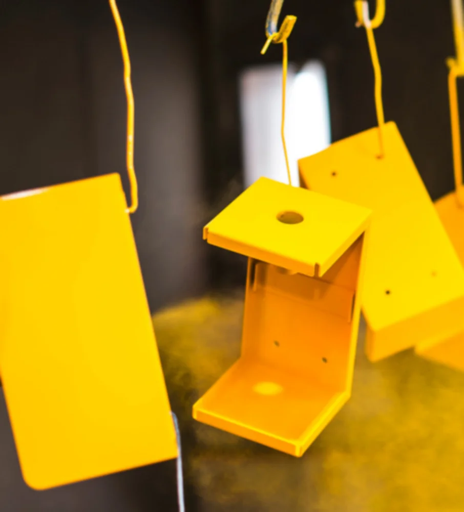
Powder coating is a dry finishing process where finely ground pigment and resin particles are electrostatically charged and sprayed onto a metal surface. The coated part is then cured in an oven, where the powder melts into a hard, uniform film. Compared to liquid paint, the result is thicker, more durable, and more eco-friendly, releasing almost no volatile organic compounds.
Why does the shade matter so much? Because pigment chemistry affects UV resistance, heat absorption, hiding power, and how visible scratches and dust will be over time. Two shades that look identical in a catalog can behave very differently outdoors. That is why an informed powder coating color decision is as much a technical choice as an aesthetic one.
Key Factors to Consider Before Selecting a Shade
Application and End Use
Environment and Weather Exposure
Type of Metal Substrate
Brand Identity and Architectural Context
Understanding Color Standards: RAL and Custom Matching
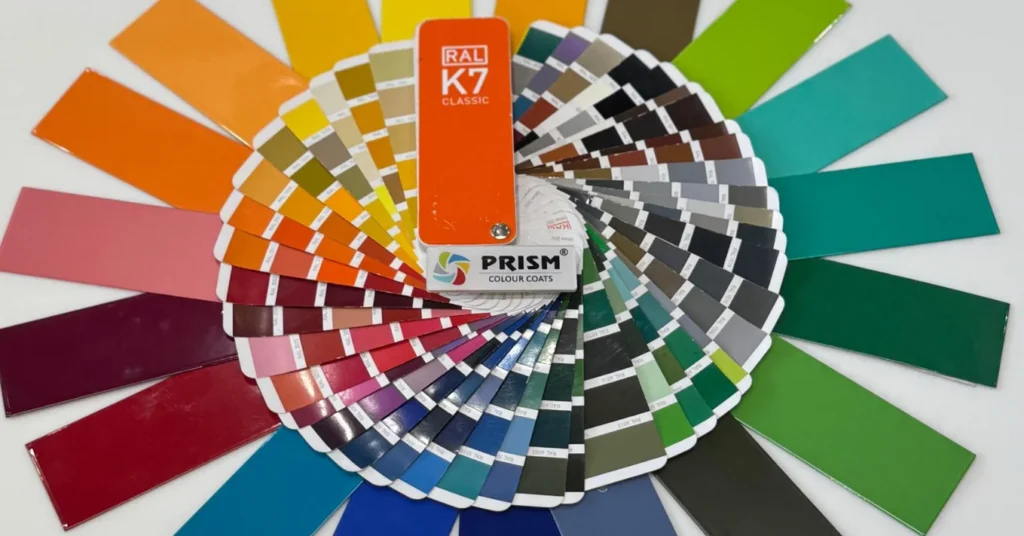
The RAL System Explained
Custom Color Matching
Choosing the Right Finish Along with the Shade
Gloss, Satin, and Matte Levels
Textured, Metallic, and Special Effects
Practical Tips From Real-World Experience
Theory is useful, but a few practical habits will save you from the most common regrets. These are lessons learned from years of production floors and site installations:
- Always approve a physical sample panel, cured on your actual metal, under natural daylight rather than showroom lighting.
- Considering heat absorption, dark shades on outdoor panels can reach surface temperatures far higher than light ones, which matters for touchable products.
- Think about maintenance: mid-tone and textured finishes hide dust, water spots, and minor scratches far better than glossy black or pure white.
- Check batch consistency for large or repeat projects, insist on powder from the same production batch to avoid visible shade variation.
- Verify outdoor durability grades ask for standard versus super durable polyester certification if the product faces direct sunlight.
A quick note on light versus dark tones: whites and light greys reflect heat and reveal corrosion early, while dark tones look premium but fade more visibly. Neither is wrong; the right powder coating color depends on what you are willing to trade.
Common Mistakes to Avoid
Industry-Wise Recommendations
Different industries have developed their own preferences for good reasons. In architecture and building facades, anthracite grey, bronze, and matte black dominate because they pair well with glass and remain fashionable for decades. Automotive and two-wheeler components lean toward glossy blacks, silvers, and vibrant custom tones with high chip resistance. Furniture and home décor brands increasingly choose soft matte pastels, off-whites, and textured neutrals that suit modern interiors. Industrial machinery sticks to standardized tones such as RAL 5015 blue, RAL 7035 light grey, and equipment greens, where visibility, hiding power, and easy touch-up matter more than fashion. If you are unsure where to start, choosing a powder coating color your industry has already validated is a smart shortcut.
Final Thoughts
Selecting the right shade for metal is a balance of science, environment, and taste. Start with the application, respect the exposure conditions, communicate through RAL codes, and never skip the physical sample. Do these four things, and your finish will look as good in year ten as on day one.
If you are still deciding, the easiest next step is to talk to people who do this every day. The team at Prismcoats helps fabricators, architects, and manufacturers choose the perfect powder coating color for every substrate and environment complete with RAL matching, sample panels, and durability guidance. Reach out to Prismcoats today and request your free shade consultation and sample kit before your next project.